So I got bored with Pivot & Panorama. It was exciting at the beginning, then when everybody else joined the Windows Phone developers camp, my apps begin to look like everyone else’s apps…
My company, Armanovus has some apps published. We also have built apps that other brands publish under their banner. For my business, I need a differentiator that separates me and other devs. If everyone can do Pivot & Panorama, and for a cheaper consulting fee, why would they go to me? 🙂
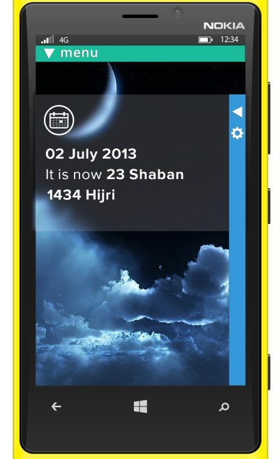
Thus begins my search for new Windows Phone UX Custom Controls…and after a month contemplating and brainstorming with my designer, I have arrived with the below design:
1. A Windows Phone app should be beautiful, but not because of square boxes called Metro Design. It should have a related background that soothes the eyes of the users, but does not distract users from the main content.
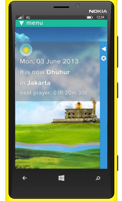
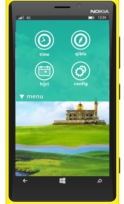
2. A Windows Phone app is divided into Views or Contexts. A view is say, when I want to check for prayer times. Another view/context is when I want to see the Hijri calendar. To change the View, user pulls down a View Menu from the Top area.
The app should NEVER hide the built-in OS Status Area (signal strength, battery level, clock) so that it does not mess with the gesture of showing/hiding the Status Area. Besides, all apps should allow the users to see the time anyway.
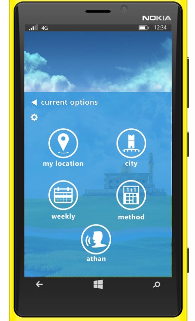
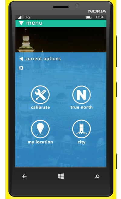
3. In a View/Context, users may see other related information or settings by pulling the Side Menu from right to left.
Finally, here is the video showing the New UX Concept in Action:
Code
The ViewModel simply provides the PNG icon, the caption text, and a Clicked event handler to do some logic when the button is clicked:
|
1 2 3 4 5 6 7 8 9 10 11 12 13 14 15 16 17 18 19 20 21 22 |
public TopMenuViewModel() { var menus = new List<MenuItem> { new MenuItem { IconPath = "/Assets/TopMenu/time.png" , CaptionText = "time", Clicked = TimeClicked }, new MenuItem { IconPath = "/Assets/TopMenu/qibla.png" , CaptionText = "qibla", Clicked = QiblaClicked }, new MenuItem { IconPath = "/Assets/TopMenu/hijri.png" , CaptionText = "hijri", Clicked = HijriClicked }, new MenuItem { IconPath = "/Assets/TopMenu/config.png" , CaptionText = "config", Clicked = ConfigClicked }, }; MenuItems = menus; } public void TimeClicked(PhoneApplicationPage page) { // go back to First Page (Prayer Times) page.NavigationService.GoToFirstPage(); } public void QiblaClicked(PhoneApplicationPage page) { page.NavigationService.GoTo(new Uri("/Views/QiblaView.xaml", UriKind.Relative)); } |
The View is simply the Top Menu user control being plugged in:
|
1 2 3 |
<views:TopMenu x:Name="topMenu" DataContext="{Binding ViewModelStatic[TopMenuViewModel], Source={StaticResource ViewModelCreator}}" d:DataContext="{d:DesignInstance ViewModels:DesignTopMenuViewModel, IsDesignTimeCreatable=True}" /> |
More Screenshots
Click on the thumbnail to see other Views screenshots of the upcoming app I’m building using this New Windows Phone UX Controls:


Look very nice z.
here’s a few feedback from me :):
1. the biggest usability issue that I can potentially see with the top View Menu is the fact that you can’t see the active/selected view. I think this is crucial to give the user a sense of spatial awareness of where they are in the app.
Perhaps consider at least having the active icon shown even when the menu is collapsed.
As a comparison, on the iOS platform, your view menu is equivalent to the bottom tab bar. They are always visible and clearly highlighting the active “tab”.
2. On portrait orientation, the side context menu is taking quite abit of screen real estate when collapsed. With the bright colors, they can be distracting the user from the actual content too.
Perhaps consider of having the context menu at the bottom instead. This way, Windows 8 users would feel fright at home (swipe from bottom to bring the context menu, swipe from right is for charms, right?) and so does WP7 users (options were always at the bottom, not sure how it is on WP8). I know you’re trying to make it look different, but I think the screen real estate is much too precious to throw away IMHO
3. Higher affordability. I like how you have labels for each of the menu when collapsed. It would help discovaribility for those who are new to the paradigm. But now in order for a person to move between views, there are 1 extra gesture (swipe – tap, rather than just swipe in panorama or just a single tap on tab bar on iOS). It’s not an issue if the user know where they are going, but imagine if they are new to the app and would like to sample through all different views. it would be a series of swipe-tap, swipe-tap, swipe-tap.
to solve this problem, perhaps consider of having the ability to swipe left and right like a panorama view. so WP8 user will feel at home. have the menu bar at the top as a shortcut to jump to a particular view and let the screen “pan” to the appropriate view.
even better, this way you can hide the top bar completely. but when the user swipe to the next view, it expands out to give the user hint of where they are and automatically collapse again once the user sticks with a view (kinda like how safari/chrome hides the browser bar automatically when you scroll downwards)
Hi Ron,
2. This is currently for Portrait apps (actually all my apps are portrait, except the Windows 8 ones), so I’m going to silently ignore this (for now at least) 😀
For moving the Context Options to the bottom: Very good idea, I wasn’t thinking familiarity with Windows 8 bottom-up gesture before.
1. Good idea, lemme contemplate where to put the Current View Icon if context menu is moved to bottom.
3. Good idea on making the Views swipe-able Left-to-Right ala Panorama. It will still be a page transition though, not in-page-sliding like Panorama. Let’s see if I can make it look alright.
Thanks for the ideas Ron, do you want your name too in the Patent I’m about to apply? 😀
hahaha. I’ll give that IP to you Z, for free this time. 🙂
is this control free? wer can i find the code?
could you share source code of qibla control ?